In Conversation With World Renowned Stationery Designer The Letterist
The Letterist has redefined the art of stationery design, crafting pieces that are as innovative as they are timeless. From pushing the boundaries of print techniques to championing a modern, gender-neutral aesthetic, the brand embodies a bold vision of love on paper. At its core is a commitment to creating designs that feel truly unique—whether it’s reimagining formats, mastering intricate print runs, or seamlessly blending craftsmanship with contemporary flair. With a decade of experience and a dedication to storytelling, The Letterist continues to elevate stationery into a form of personal expression, offering couples designs that are as meaningful as the moments they celebrate.

“Couples nowadays are not necessarily heterosexual, not necessarily young, not necessarily involving their parents... and I wanted to create collections that responded to and embodied more modern and progressive societies and celebrations.”
The Letterist has become synonymous with bespoke, modern stationery. What inspired the creation of the brand, and how has its vision evolved over time?
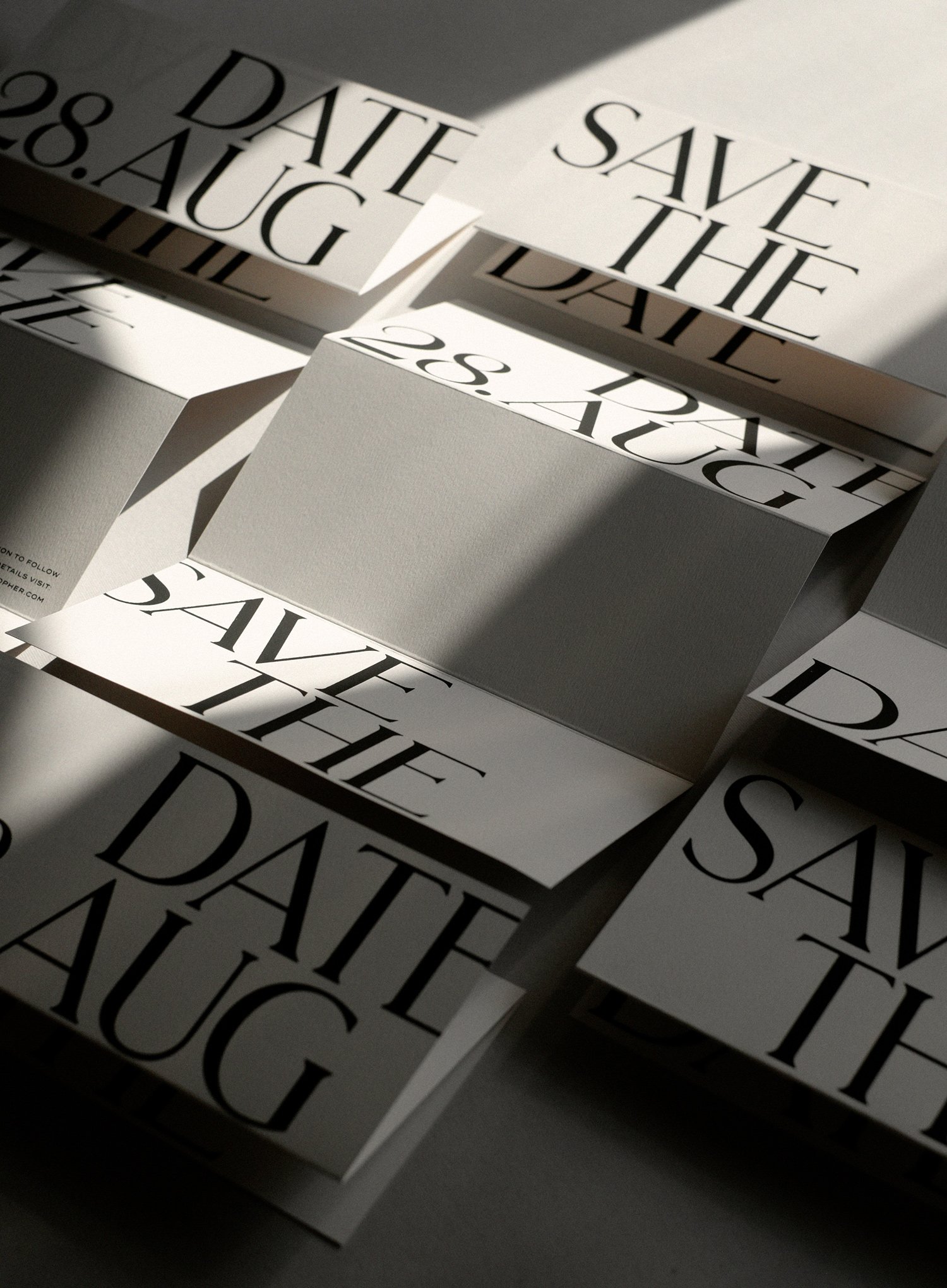
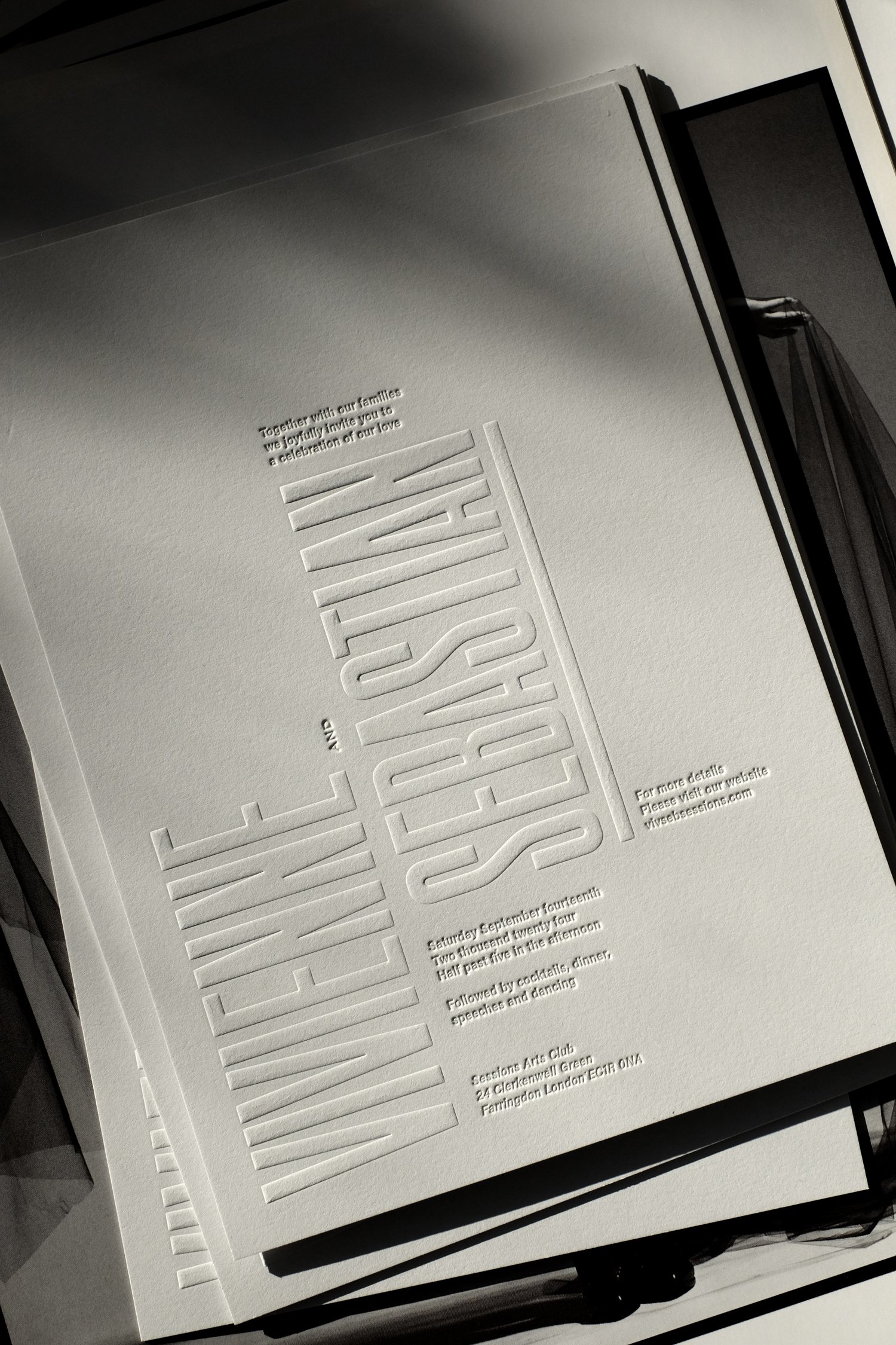
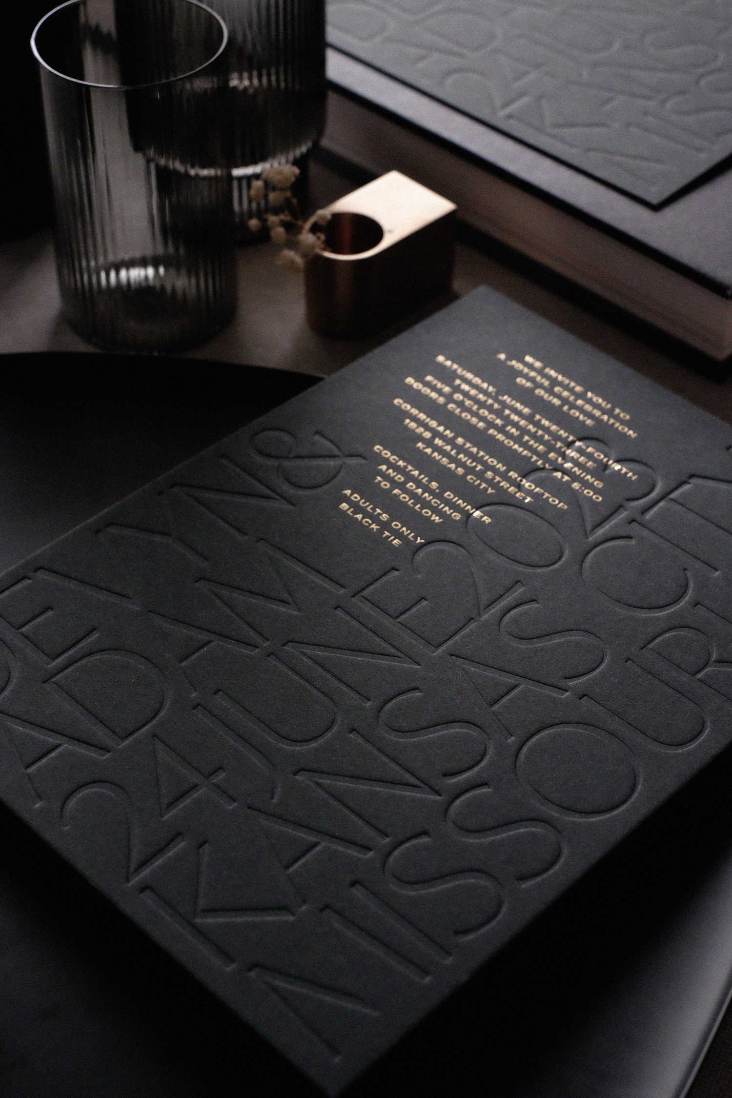
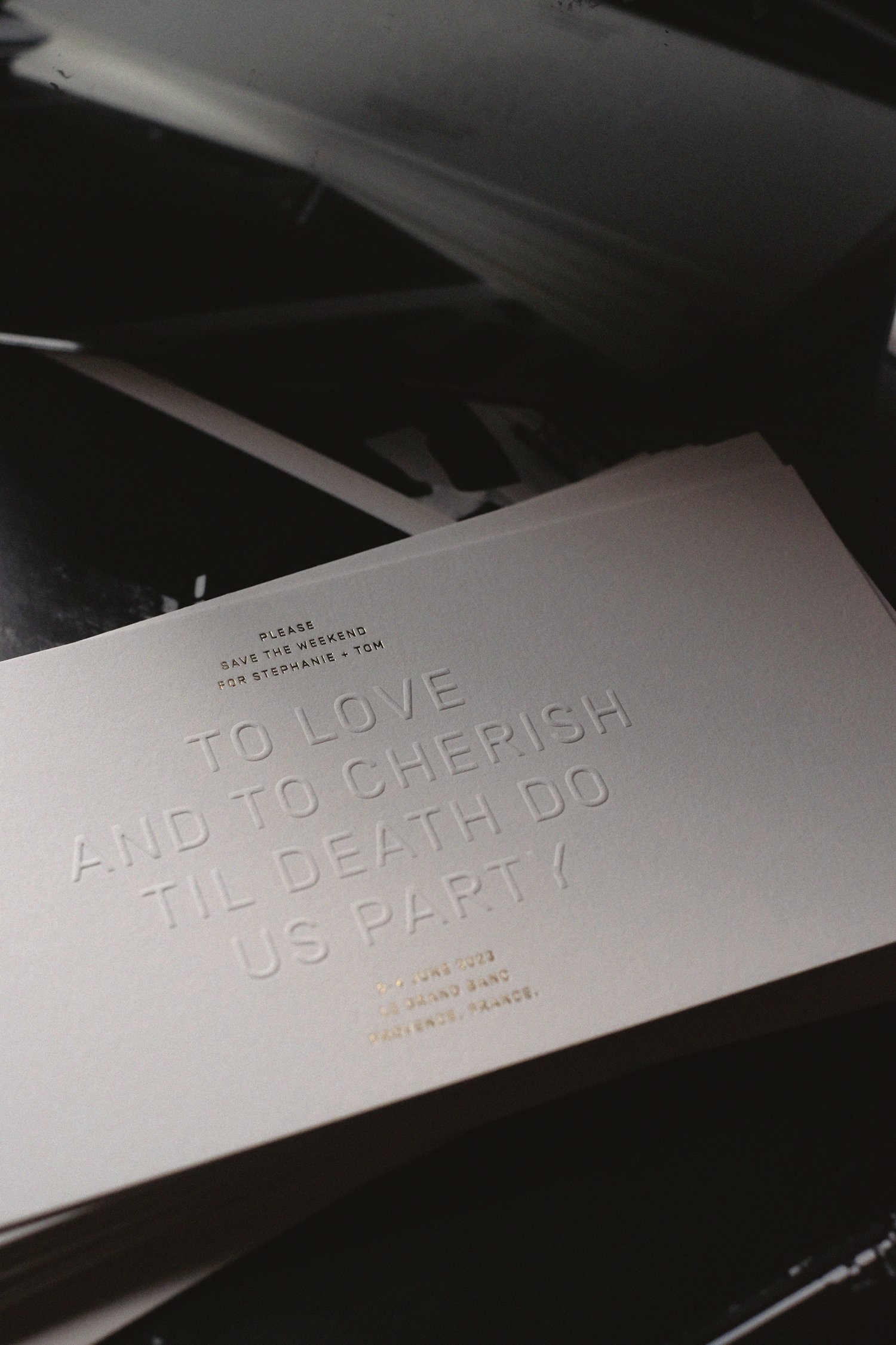
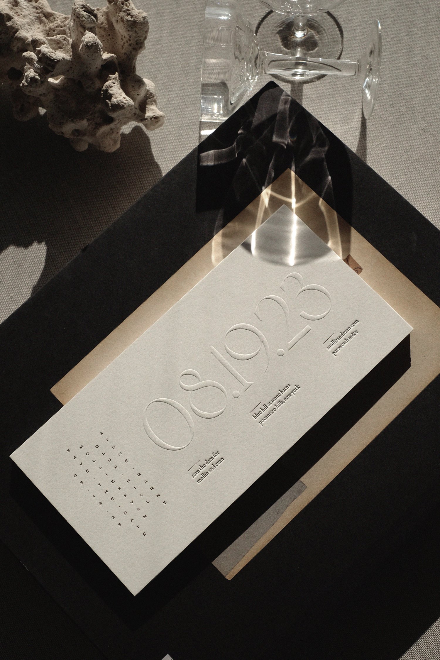
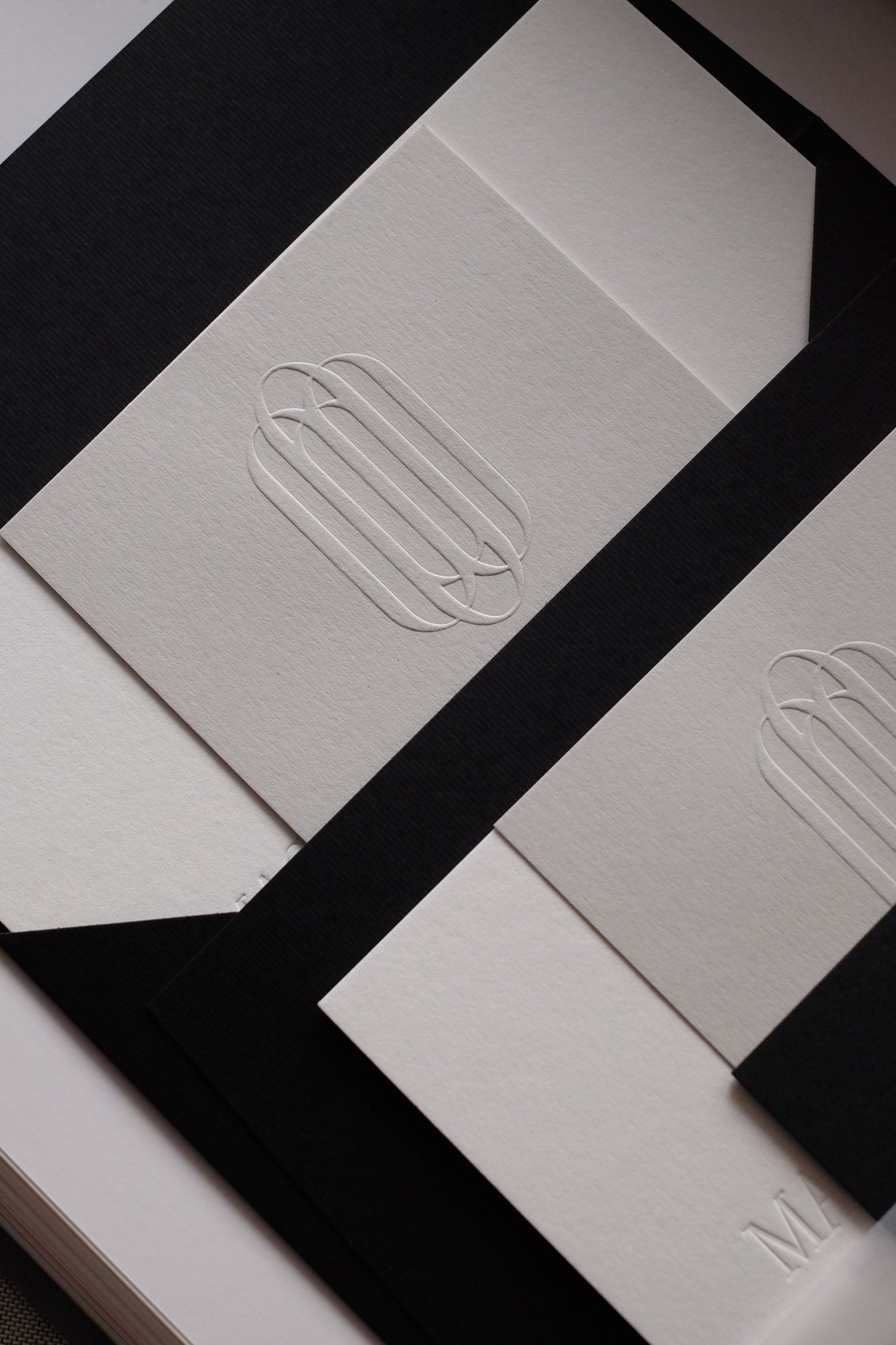
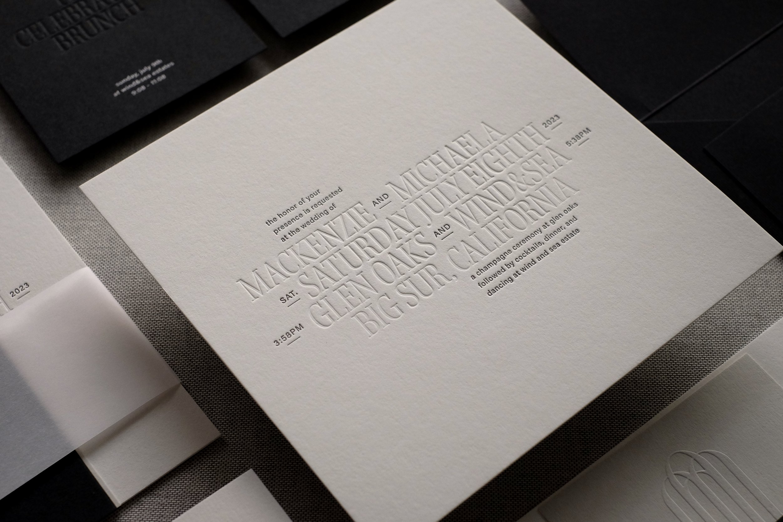
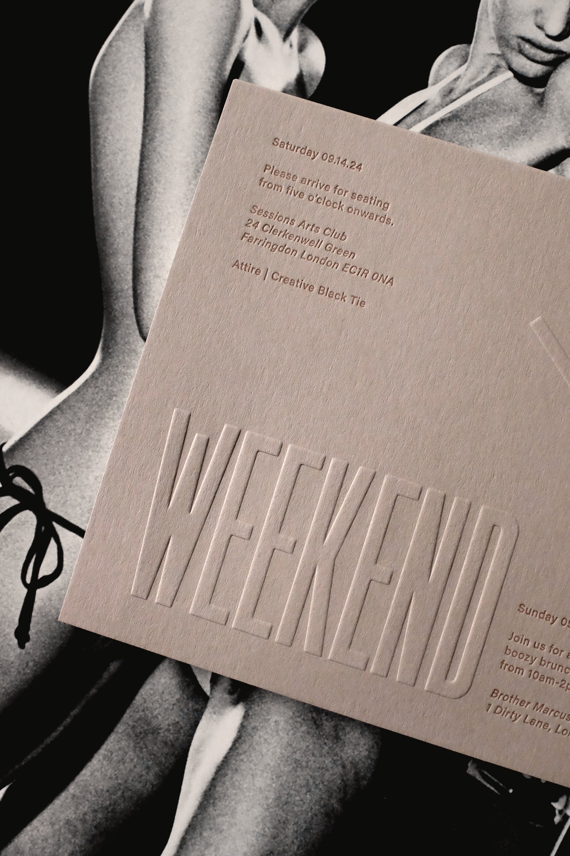
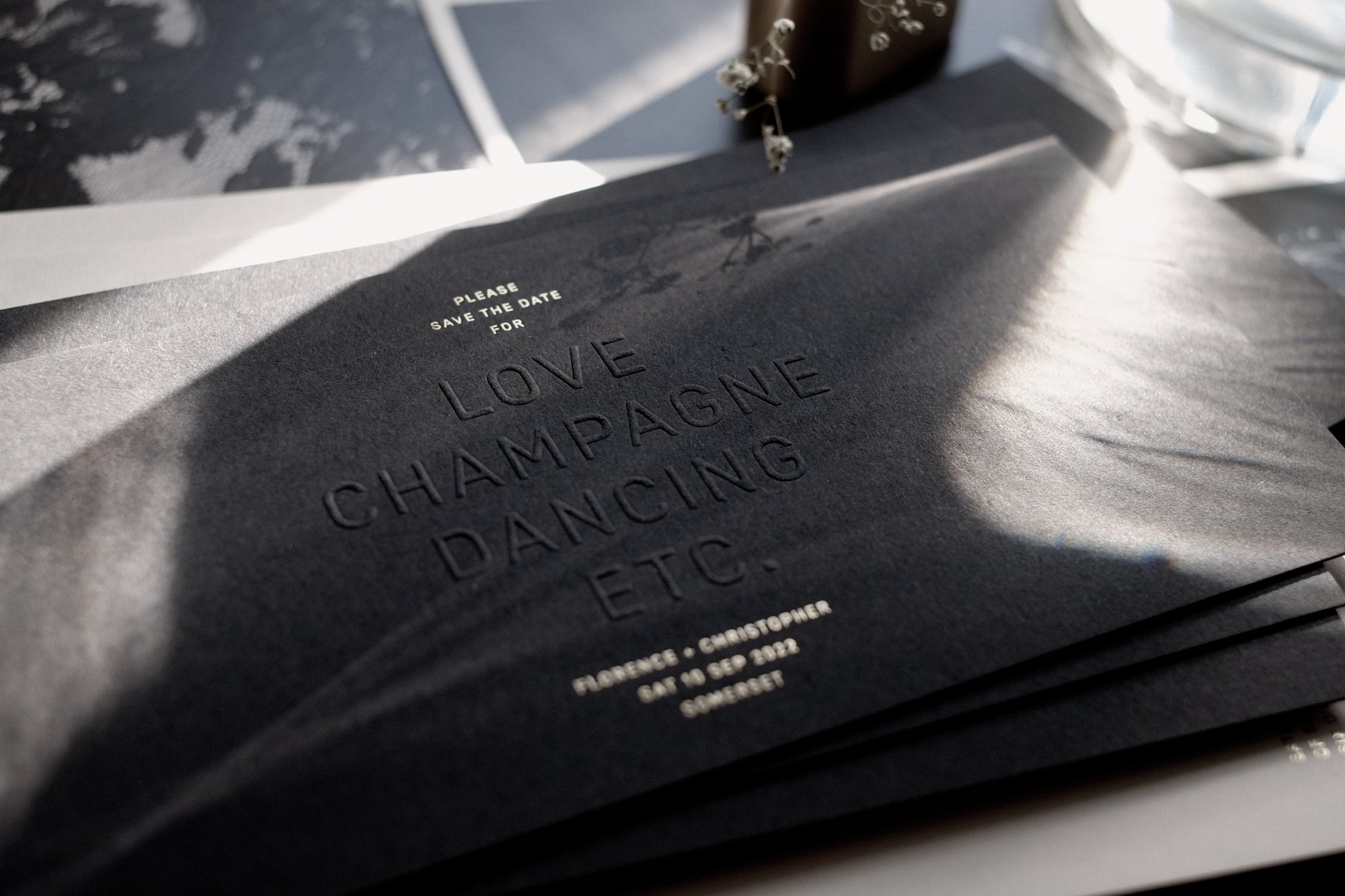
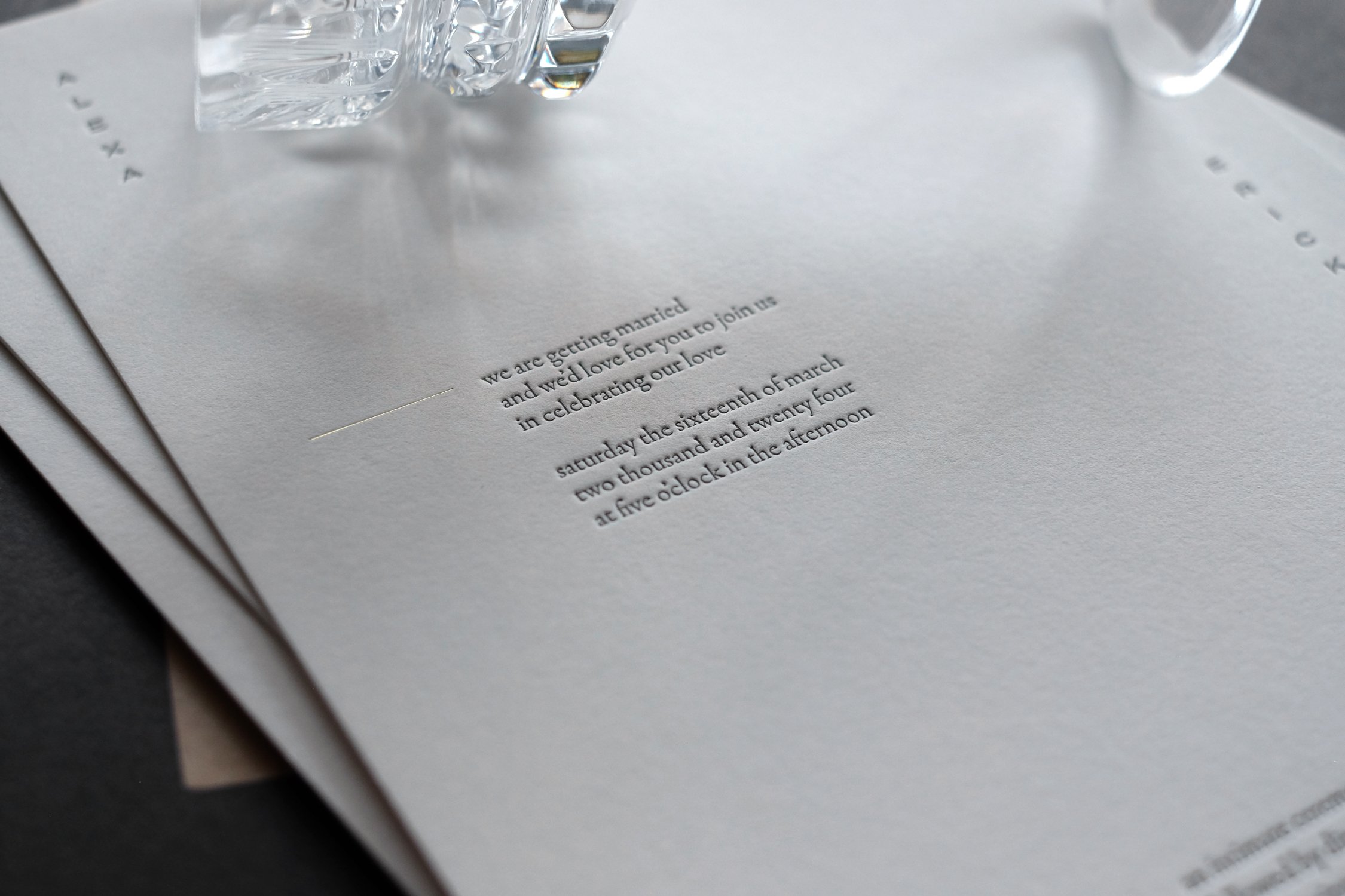
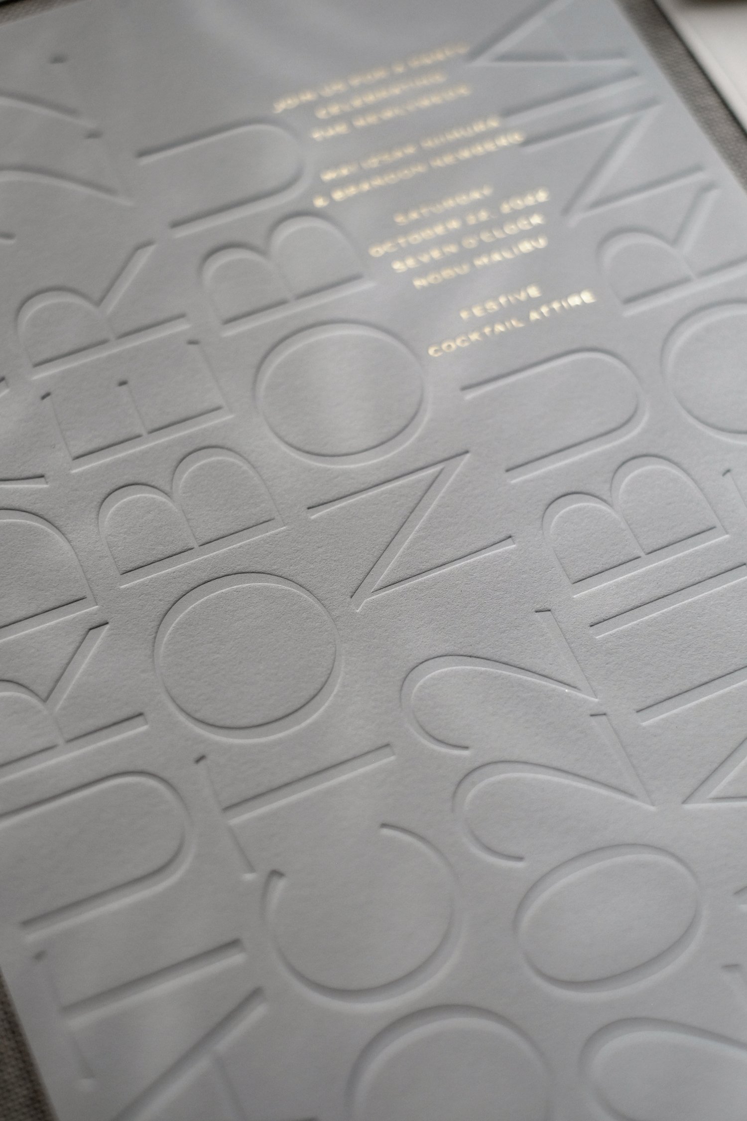
Before we design anything, be it a wedding invitation, reception menu, business card, book or flyer, we ask ourselves the question; How can we make this look UNLIKE anything that's been done before? Sometimes the answer is as simple as switching up the format... what about a large wedding invitation that folds to fit in an envelope? Sometimes it's about combining multiple print techniques that others would avoid because it appears too complicated or expensive. (We've done pieces with 5 or more runs through presses! Blind emboss + blind deboss + foil emboss + foil deboss + letterpress...) Sometimes it's a gentle nudge to the printer when he says "I'm not sure we can make this work", to say well, let's give it a try and tinker with both the design and production accordingly until it does work. Over the years we have mastered certain print techniques; like the large debossed or embossed typography in our collection The Dreamer...the first time I proposed this, the answer was no! This is way too big! It turns out it isn't... and if we need to break something up into smaller print plates and just do more runs, we never shy away from extra work, hours, energy, and refining, because in the world of specialty printing, more craftsmanship and attention to detail always proves worthwhile in the final result.
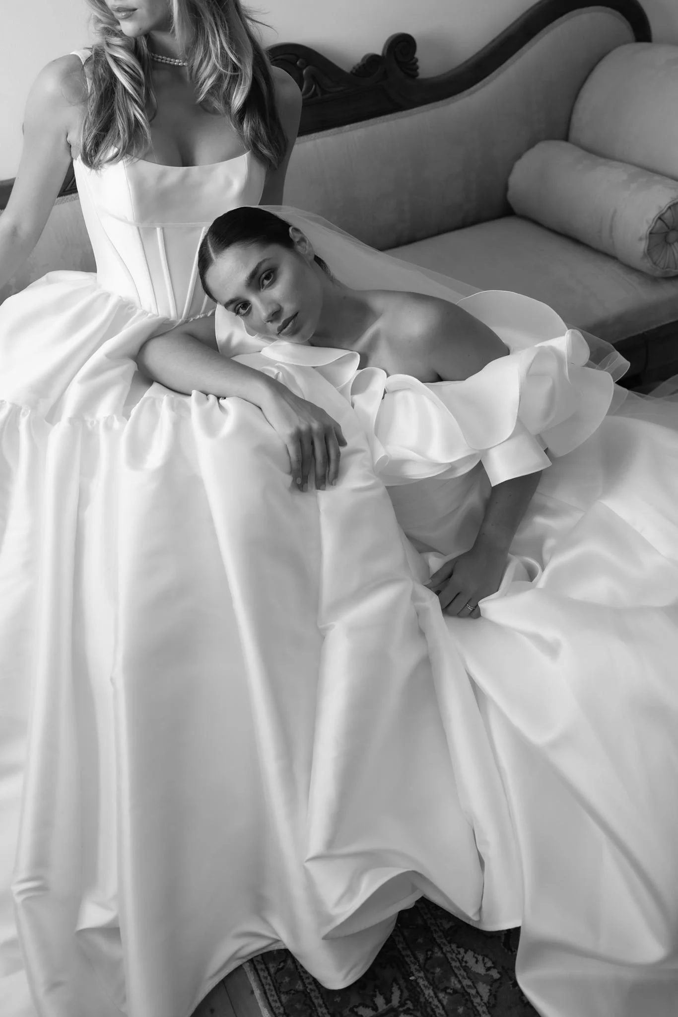
One of our other missions from the beginning was to make wedding stationery look less "girly." After our first couple of years, our print portfolios were full of pink and purple, watercolor textures and floral illustrations, script fonts and calligraphy. Besides the fact that these pieces were not reflective of my own personal style (as the Founder and Creative Director) and didn't make me feel proud to look through my work, I felt it all appeared outdated and from a previous era where a bride's parents organised and financed the entire wedding and things ended up looking a little more fitting for a sweet sixteenth. Couples nowadays are not necessarily heterosexual, not necessarily young, not necessarily involving their parents... and I wanted to create collections that responded to and embodied more modern and progressive societies and celebrations. I wanted invitations and day of stationery to be more gender neutral - romantic, sexy, sophisticated, subtle, impressive... but not obviously or stereotypically feminine or masculine. I strongly believe and we work to create pieces that speak to both of the people getting married, as well as the colorful variety of all their guests. Of course, I most enjoy working with couples where they both take an interest in the stationery and equally get involved in the process.
Craftsmanship and attention to detail seem integral to your design philosophy. Could you walk us through your creative process when designing for a client?
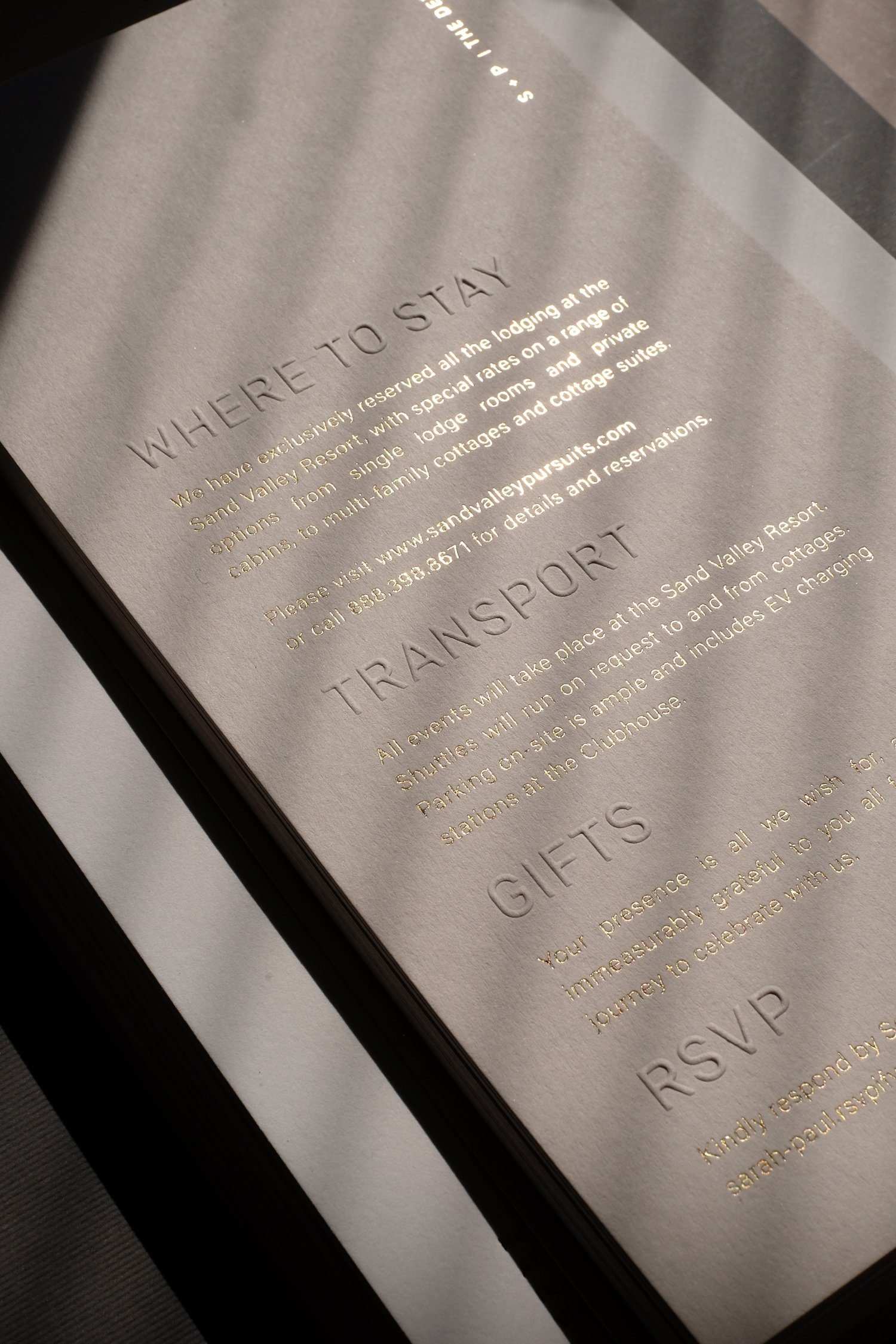
There are so many minute technical aspects to consider when working on letterpress invitations or day-of-stationery. How thick are the papers... how will they all stack and fit in an envelope... how will different print techniques appear on different compositions and colors of paper fibres... how will guests interact with them... how deep are the impressions and shadows... how do we find a balance between subtlety and beauty and functionality and legibility? It's endless. One of the reasons we moved away from fully custom projects and introduced semi-custom collections was to enable us to truly master particular formats and techniques and give us more control over both the process and the results. Fully custom projects are always a bit of a guessing game, we can rely on past examples and lessons - but you never fully know how it's going to turn out until it's done. I fall asleep a lot more easily now!
With regards to our process, we hold your hand and walk you through every step of it with professionalism, lightness, and a whole lotta love. We begin with wording and basic layouts, exploring how many pieces we may need and how best to structure and organize content. We then move onto the more decorative aspects of paper and envelope colors and print techniques. And then we get into the nitty gritty logistics of who's invited to what, how much postage you'll require, which RSVP deadline would best suit timelines for all other relevant vendors, etc. The very last step is a spritz of perfume in the box with the hope that you'll have a truly sensual experience when it all arrives.
Your work often balances timeless elegance with contemporary flair. How do you ensure this harmony while tailoring designs to individual couples?
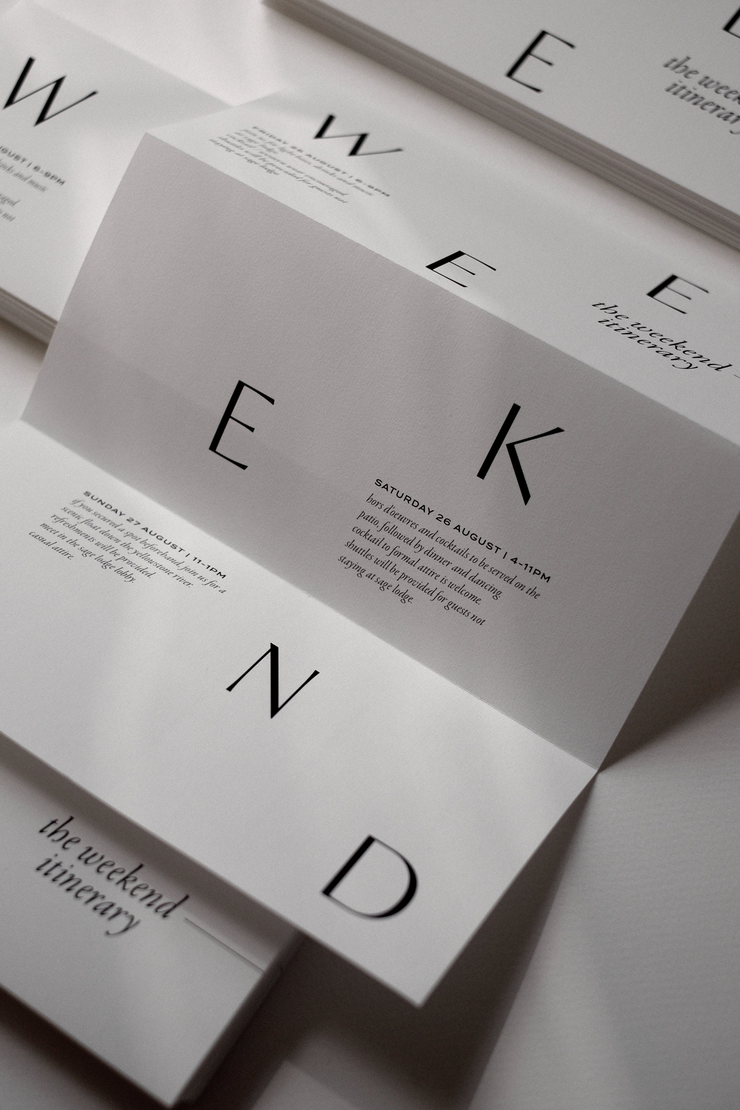
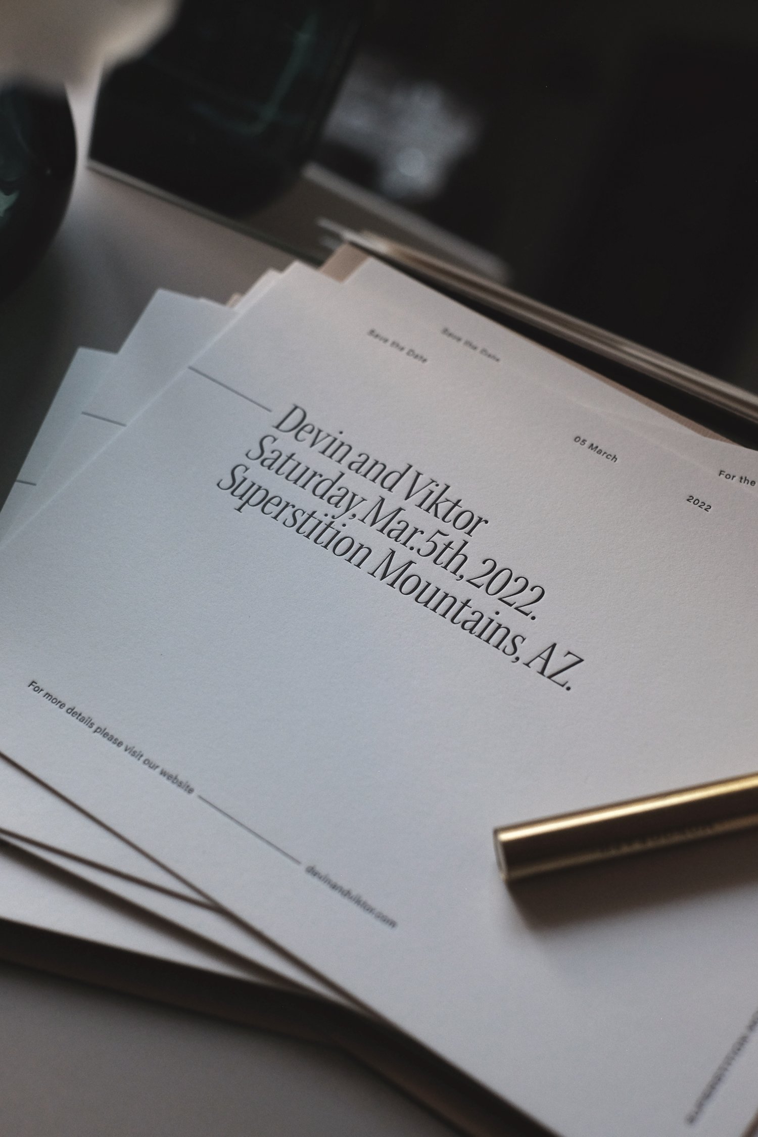
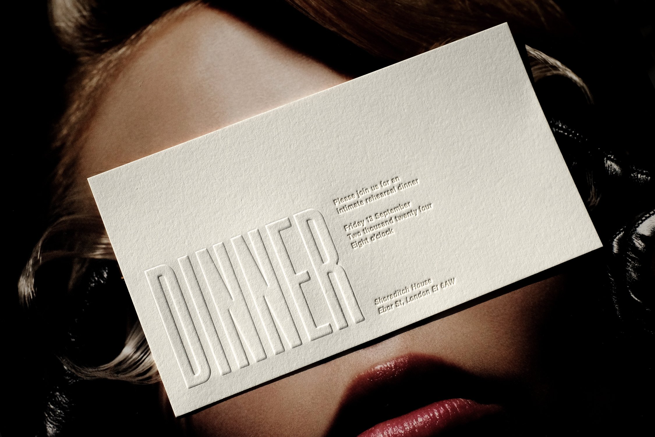
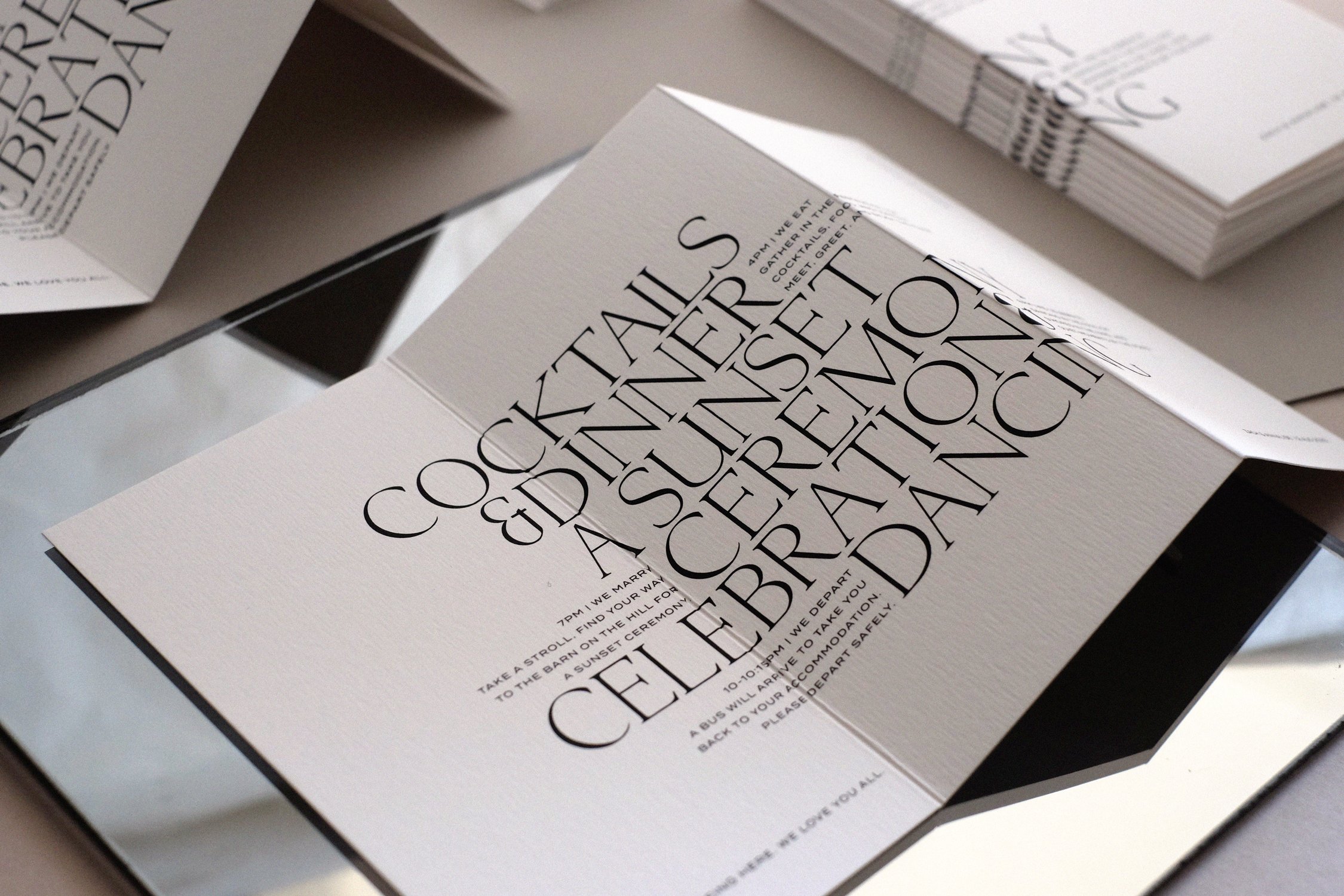
We have a lot of tools to work with...typography, scale, paper, texture, color, print techniques, and always try and find one or two places to "flip the script." If the paper colors and formats are more traditional, let's work with a modern font. If we're using an old typeface, maybe we go all lowercase or pick a fun vibrant ink or color. If it's all traditional in appearance, maybe the tone and voice of the wording can be more casual. We consider all these elements at the same time and collaborate with our clients and their event teams to try and find the "perfect" balance... or perfect imperfections that will result in pieces that are sophisticated and stunning, but never staid. Also, in an industry where everything so often is white...we use a lot of BLACK.
Sustainability and material quality are key elements of luxury stationery. How do these values influence the choices you make in production?
My production partners tease me for always choosing the most expensive materials. I try to imagine that even though much of what we create is treated as "ephemera" and only intended to serve a purpose for a particular day or moment in time, if we make it beautiful enough, people will treasure these pieces for decades to come. I love to see photos of guests leaving a wedding holding their programmes, menus, clutches and heels in hand! Raising our commitment to the environment and sustainability is something we are working on constantly and we have some really fun new solutions planned for the new year. For the most part, we almost exclusively use recycled materials for day of stationery, and our suppliers are continually expanding their offering which means we long evolved past brown kraft paper being the only option. We also recycle and hoard a lot in the studio. I have countless ideas for how we will use and reuse the tons and tons of paper we have kept and collected over the years.
Personalisation is a defining feature of The Letterist. What do you find most rewarding about translating a couple's story into a tangible design?
While all of our wedding projects take the direction of our semi-custom collections, we always add personalized details that reflect something specific about the couple or destination they are getting married in. We recently had a bride send us an illustration that her late grandmother had drawn for her bat-mitzvah invitations, which we vectorized and screen printed on the vellum bands that held their invitation suites together. We also foil stamped it smaller on their RSVP envelope flaps. That is only one example, and I'm getting goosebumps right now just writing about it. I adore the personal and romantic stories we hear from our clients and coming up with creative new ways to put them on paper. There is so much we can do...even if it appears at first glance that our collection designs are pretty set in stone. I will personally work with couples to show them they are far from it.
As you look to the future, what exciting developments or projects can we anticipate from The Letterist?
Ooohhhh! So many things! We just celebrated our ten-year anniversary in October and made a big long list of dreams and goals for the next ten. Taking "Love on Paper" more online is definitely our first mission with weddings. We introduced wedding websites this year, and are hoping to introduce digital Save the Dates and Invitations in 2025. We have other big news and are merely days away from signing on a dotted line... for that you'll need to follow us on Instagram and stay tuned!
Find The Letterist online by CLICKING HERE or follow on Instagram at @theletterist
DISCLAIMER: We attempt to credit the original photographer/source of every image we use. However, in most circumstances, the images we use are provided by the brands spoken about, and we rely on them to inform us of the image source. If you think a credit may be incorrect, please contact us at info@theodoremagazine.com
More For You